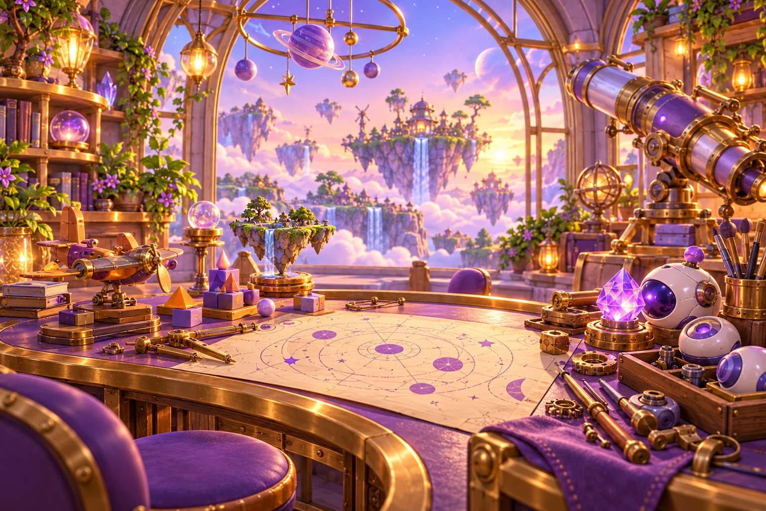
Start with a place, not a symbol
The Little Cosmos has room for different kinds of attention. Ember’s workshop is about possibility, Mira’s ocean is about noticing, and Finn’s district is about making room to move. Their images need to tell you something about those ideas before an instruction appears.
That is why character artwork leads the website. A face, a setting and a few familiar materials are more useful here than a row of interchangeable feature icons. The pictures establish the world; the interface gives you a clear way to enter it.
Let the palette do a specific job
Violet connects the studio’s pages, while each game carries a smaller accent from its own illustration. Warm workshop tones feel different from the cool water of Tidebound or the open blue of Cloud Rally. A colour can set a mood without becoming the only way to explain a rule.
Numbers, labels, silhouettes and position still carry important information. A destination on a puzzle board has a mark as well as a colour. A selected control has a visible state. A game should not ask you to guess its instructions from decoration.
Give the character room to be a character
Large illustrations are most effective when they have space around them. We keep small instructions away from busy artwork, use quiet surfaces around the player and let editorial pages change rhythm through scale and composition. An orbital motif can sit at the corner; it does not need to sit behind every sentence.
The result is a shared studio identity with distinct worlds inside it. Consistent navigation helps you find your way, while each game’s imagery invites a different kind of curiosity. The goal is for the next page to feel both recognisably Nova and worth discovering.