Audience
Small product teams sharing responsibility for an interface.
FICTIONAL CASE STUDY / Design system
A small library that speaks clearly.
Give designers and developers a component reference they can read together.
Try the design ↓
Small product teams sharing responsibility for an interface.
Each variant and interaction state needs a concrete use case.
Component taxonomy, semantic tokens and a handoff specimen.
FICTIONAL CONCEPT DESIGN
Three views of the Petal Kit interface.
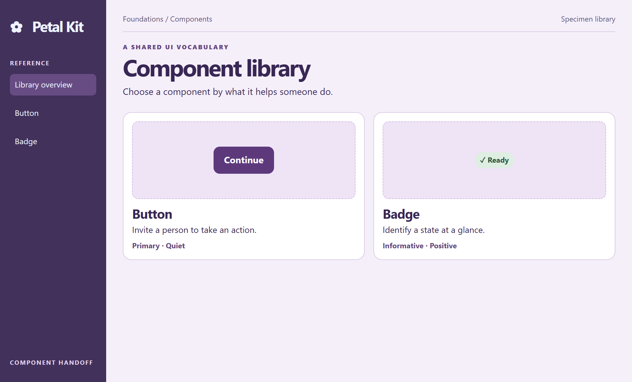
Buttons and badges are grouped by purpose, with component names and examples ready for handoff.
Open full size ↗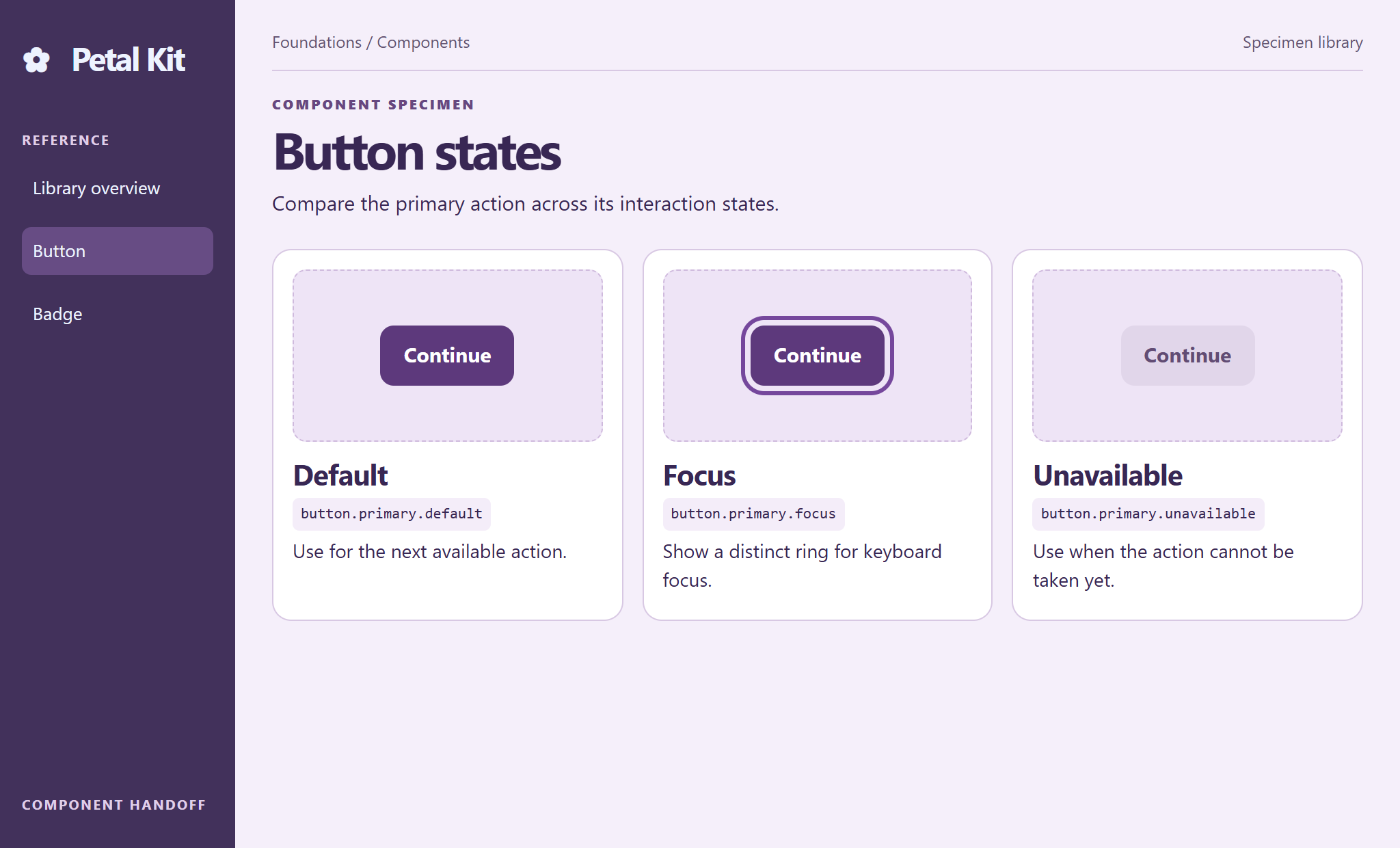
Default, focus, and unavailable examples sit side by side so developers can compare appearance and behavior.
Open full size ↗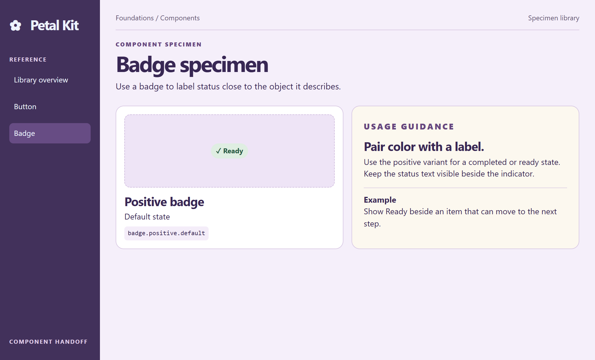
The status badge appears with its semantic token and usage note so the team can apply it consistently.
Open full size ↗TRY THE DESIGN
Choose a component, change its variant and state, then read its token and usage note.
Fictional design prototype with sample data. Changes stay on this page.

THE TRADE-OFF
A static gallery is quick to scan. An adjustable specimen makes differences easier to compare.
DESIGN NOTE 01
The specimen, token and usage note change together to keep each choice traceable.
NEXT TEST
See if two collaborators independently choose the same variant for a shared requirement.
KEEP EXPLORING