Audience
Readers switching between a desk, tablet and phone.
FICTIONAL CASE STUDY / Responsive website
A reading room that travels well.
Help readers find short essays and field guides between longer reading sessions.
Try the design ↓
Readers switching between a desk, tablet and phone.
Titles vary in length and the collection must reflow with enlarged text.
Content taxonomy, responsive rules and an article preview.
FICTIONAL CONCEPT DESIGN
Three views of the Fieldnote interface.
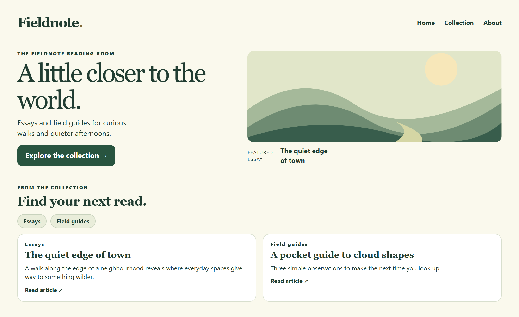
A featured essay sets the reading pace. Topic links and the latest entries provide clear routes into the collection.
Open full size ↗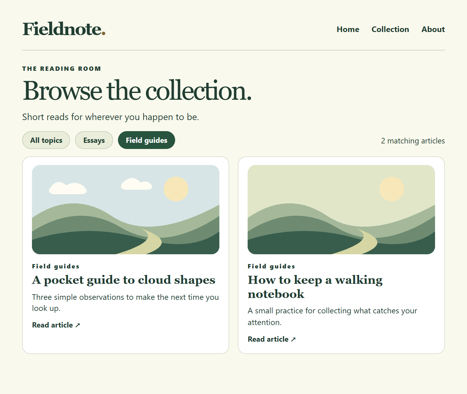
The selected Field guides filter stays visible above a two-column list, with the matching item count close by.
Open full size ↗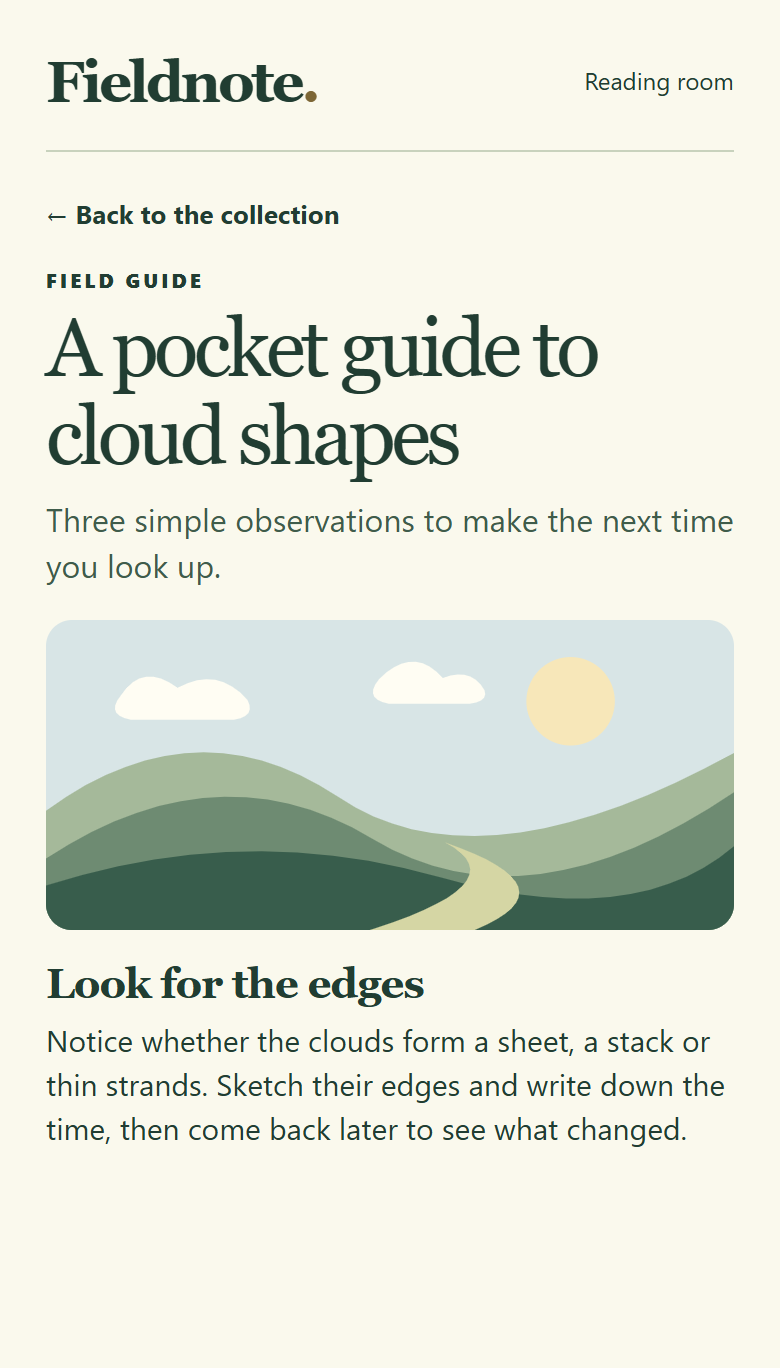
A single reading column gives the title and article room to breathe. A return link leads back to the collection.
Open full size ↗TRY THE DESIGN
Filter to Field guides, open an article preview and compare the three widths.
Fictional design prototype with sample data. Changes stay on this page.

THE TRADE-OFF
A masonry layout gives images more drama. A reflowing grid gives readers a predictable sequence.
DESIGN NOTE 01
Preview controls resize the collection itself while preserving the source order.
NEXT TEST
Compare how easily readers find a guide at narrow widths and with enlarged text.
KEEP EXPLORING